
From all the jawboning you’re likely hearing, you might be inclined to think that inflation’s been pretty much strangled. If you track the Consumer Price Index (CPI), you’ve probably noticed that growth in the headline number has stayed below 2 percent this year. That’s not to say there’s NO inflation; it’s just that inflation’s been tamed, at least as measured by prices in the Bureau of Labor Statistics’ basket of goods and services.
But what about the future? Some pundits say clues about inflation’s prospects can be gleaned by listening to the stock market. Martin Pring, for example, has had his ear on the market’s rails for years. He’s devised indices that measure the market’s inflationary and deflationary momentum. Pring’s inflation indicator comprises earnings-driven stocks from the basic industries, steel, chemicals, mines and energy sectors, all of which tend to surge when commodity prices are rising. These, opines Pring, signal the latter stages of an economic cycle.
Bonds and interest-sensitive stocks such as preferreds, banks, insurers and electric utilities make up Pring’s deflation index. It’s in the middle to the late phases of a recession and the early stages of a recovery that these assets are likely to outperform.
That’s not to say to that appreciation in Pring’s indices is mutually exclusive. Both inflation- and deflation-sensitive assets can rally contemporaneously. It’s their relative performance that’s really important. In the past month, for example, both measures gained, though at widely disparate rates. The inflationary index appreciated 14.7 percent while the deflationary index rose just 2.7 percent. If you put Pring’s inflation indicator in ratio to his deflationary index, as shown in the chart below, you can rather quickly appreciate the market’s view of the economy. A rising ratio is inflationary; a sinking value denotes a deflationary environment. That said, the ratio’s recent push above its 50-day moving average indicates we’re in the inflationary phase of a mature cycle.
Pring’s Inflation Index vs. Deflation Index
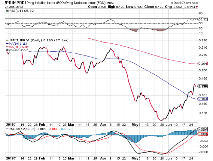
What’s the value in such an indicator? Well, for one thing, there’s a direct correlation between the ratio and the commodity market. In fact, Pring’s metric often leads commodities at peaks as well as at troughs. The chart shows the ratio bottoming in late May, about three weeks before a nadir in the Thomson Reuters Equal Weight Continuous Commodity (“CRB”) Index appeared. Turning points such as these can be early warnings to portfolio managers to adjust exposures for an upcoming sea change.
Last month, money runners would have noticed inflation-sensitive sector ETFs, most particularly the Materials Select Sector SPDR (NYSE Arca: XLB) outperforming the broad market. XLB closed out June with a 9.7 percent gain versus 5 percent appreciation in the S&P 500 SPDR (NYSE Arca: SPY). And now? XLB has broken to the upside of a consolidation area and seems to be aiming for a target some 20 percent higher.
Keeping an eye on inflationary and deflationary pressures ought to be de rigueur for any investor, not just professional money managers. All this is made easier by watching Pring’s ratio, an organic outgrowth of such diligence. As entrepreneur and author Jim Rohn once said, “If you do something often enough, a ratio will appear.”
Brad Zigler is WealthManagement's Alternative Investments Editor. Previously, he was the head of Marketing, Research and Education for the Pacific Exchange's (now NYSE Arca) option market and the iShares complex of exchange traded funds.


