
Health care has been in the forefront of the news recently. As lines are drawn in the sand atop Capitol Hill, investors are left scratching their heads (and their wallets) over the prospects of health care stocks. Is the American Health Care Act (ACHA) a good thing or not?
If you go by the recent trajectory of the Health Care Select Sector SPDR ETF (NYSE Arca: XLV), a 62-stock tracker of large-cap issues including Johnson & Johnson (NYSE: JNJ) and UnitedHealth Group, Inc. (NYSE: UNH), you might think “not.” In the past week, XLV’s share price has slipped one percent lower.
You can’t look at health care issues through the XLV prism and expect to see the sector in its entirety, however. The PowerShares S&P SmallCap Health Care Portfolio (Nasdaq: PSCH) mirrors the aggregate performance of small- and micro-cap stocks such as Masimo Corp. (Nasdaq: MASI), Haemonetics Corp. (NYSE: HAE) and 77 others. Last week, PSCH’s share price gained one percent.
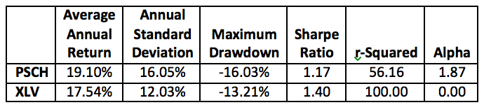
PSCH, in fact, has outperformed XLV on several measures over the past five years. For health care investors who can withstand small stock volatility, PSCH might offer greater diversification than XLV. PSCH correlates to the broad U.S. stock market at .72, significantly lower than the .83 coefficient for XLV. Here’s how the two ETFs compare since February 2012:
Is PSCH the better health care play going forward? Perhaps for some investors. Aside from PSCH’s price volatility, large players need to be mindful of its liquidity. XLV has $16.6 billion under management; PSCH less than $200 million. XLV trades about 9 million shares daily; PSCH’s turnover averages a mere 12,000.
Still, recent price activity makes a compelling case for PSCH. A head-and-shoulder bottom has been developing since last summer. This pattern is one of the most reliable technical indicators of upside potential, reaching projected target prices about 83 percent of the time. The pattern is characterized by two swing lows (the right and left “shoulders”) bracketing an even lower low (the “head”).
You can see these lows marked on the chart below. You’ll also see a dotted “neckline” scribed, representing the pattern’s projected breakout level. A neckline is drawn through the reaction highs following each shoulder’s swing low.

This chart pattern suggests that when (and if) PSCH’s price breaks above the neckline, an upward move equal to the spread between the head’s low point and the neckline directly above it is on offer. For this ETF, that’s a $13, or 17 percent, gain.
So, while you follow the upcoming health care debate in the House, keep an eye on PSCH. This ETF may be a palliation for the dyspepsia that usually accompanies such political wranglings.
Brad Zigler is REP./WealthManagement's Alternative Investments Editor. Previously, he was the head of Marketing, Research and Education for the Pacific Exchange's (now NYSE Arca) option market and the iShares complex of exchange traded funds.


