
I am first, foremost and solely a U.S. Interest Rate Strategist (call me I-rate for short) so it is with no shortage of anxiety that I dare delve into the equity market. Caveat emptor; I’m typically bullish on bonds and bearish on stocks so what follows panders to a career bias. That said, I do look at the evidence and there are things out there that make me wary of equity valuations which, all things being equal, should serve as a brake of sorts on a sharp rise in bond yields.
The equity gurus cite various broad perspectives like P/E ratios on the S&P 500, those trailing, those forward looking, and variations on that theme. I’ll follow their lead. I like to look at the offbeat, not the least because that might raise fewer challenges to my analysis. In the spirit of looking at the equity market, and by proxy the financial health of corporate America, I looked at the actual cost of a share of the S&P 500 in terms of what it would take an "average" American to buy it.
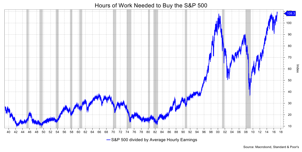
Using Average Hourly Earnings, one would have to work 108.3 hours to buy a share of the S&P 500. This is only slightly above the peak of March 2000 (107.8 hours) and well above the peak prior to the last recession of 89.8 hours. A market technician looking at a chart of this might caution a double top—a reversal pattern. So, at least by this simple measure, it’s fair to argue that stocks cost a lot of money to the average American which is probably one the reasons that many Americans don’t actually own stocks. A recent Gallup Poll puts the figure at 52 percent; the lowest level in Gallup’s 19-year trend.
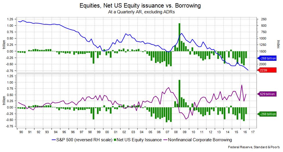
The big buyers, of course, have been the companies themselves. The Fed’s Flow of Funds data shows that net equity issuance for the first three quarters of last year was $1.295 trillion following on $1.32 trillion for all four quarters of 2015. (Net Equity Issuance is simply the change in the net dollar amount of shares outstanding. A negative figure means that either the shares were bought in buybacks or through M&A action.) That’s an awful lot of working hours if you think about it. There is a flipside to this that I’ll get to in a moment.
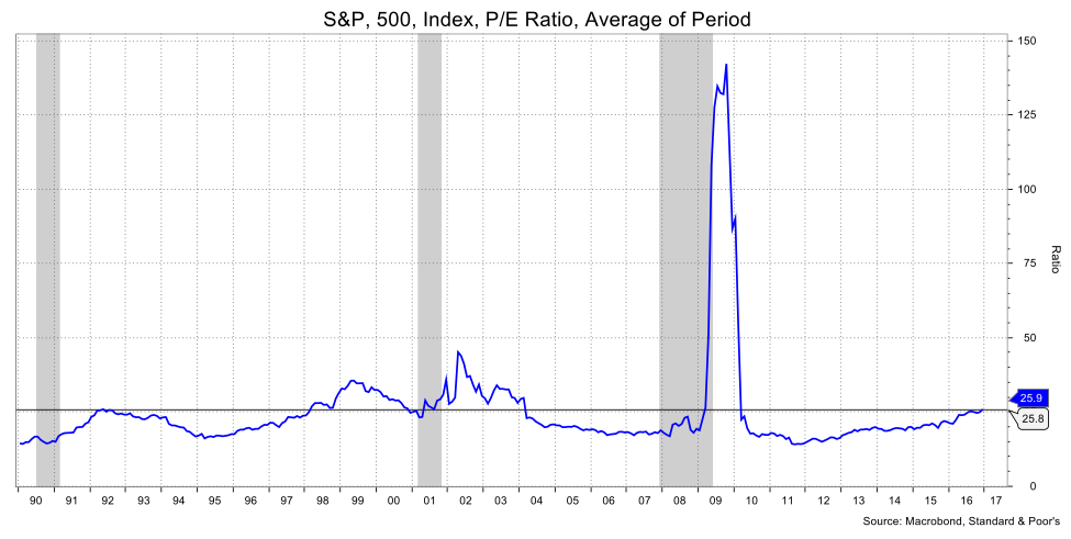
Although I said there were better people than me to discuss P/E ratios, I’ll do it anyway. S&P puts it at 25.9 for the S&P 500, which is the highest it’s been since 2010, and with the spikey exception of the extraordinary days that followed the financial crisis, the ratio was last at that level back in 2004. So, again, rather high.
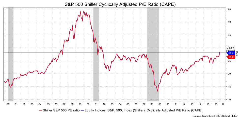
Another way of looking at this is the CAPE Shiller P/E which is the price (the P part) divided by the moving average 10 years of earnings (the E part) adjusted for inflation thus giving it a longer time-frame. That stands at 28.2, just over the peak it reached from 2003-7. That said, it bounced up to that level with only minor pullbacks for those four years.
Another cause for my concern is the caution that market shows in volatility measures. With valuations arguably extended and, hmm (careful here) a degree of discomforting spontaneity stemming from the White House, why is the VIX so low? (The VIX is an index put out by the CBOE that measures the implied volatility of S&P 500 options, also known as the “fear index”.) At 10.6 it is basically at its post-crisis lows.
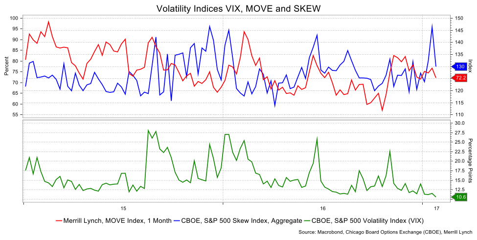
A related index is the CBOE’s SKEW that measures tail risk based on out-of-the-money options. On January 20, it boasted a move to its second highest level ever, but has subsequently come off. Am I the only one anxious?
I earlier mentioned a flipside to negative net equity issuance, which is that the buybacks have come at the expense of massive corporate borrowing, a subject my colleagues at Informa Global Markets follow intensely. To wit, there’s been an explosion of corporate issuance which in turn should create at least some concern with the overall size of corporate indebtedness.
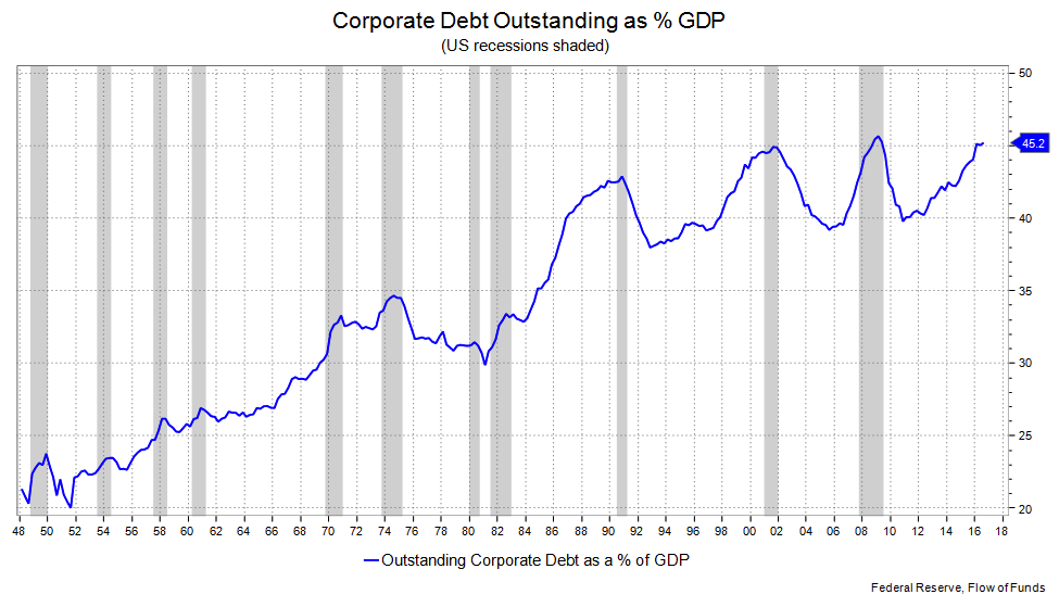
Outstanding corporate debt as a percent of GDP is 45.2 percent. That’s the second highest in history, marginally surpassed at 45.6 percent in Q1 2009 and almost touched in Q4 2001. Do those dates ring any bells? They were the height of the last two recessions, and that’s especially notable because the excuse for such a high percentage during a recession comes on the back of weaker, negative, GDP. The current level comes with GDP growth and so is a function of the increase in issuance.
Do I need to mention that this borrowing has been for buybacks etc., but not for the sort of investment that enhances productivity or expands the economy? The most recent FOMC statement, which was otherwise somewhat optimistic, noted “business fixed investment has remained soft.” This is rather late in the business cycle to see such a comment.
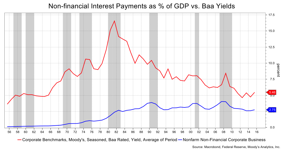
Related to that are corporate interest payments. Non-financial corporate interest payments are 2.75 percent of GDP (1.9 percent on a net basis). The net payments are near a peak and the overall is remarkably high considering how much corporate yields have come down. You’d think the payments would have followed rates more closely; that they haven’t raises the question of how much those payments rise when interest rates lift further and/or when spreads widen out. The easy call is that new issuance should decline, but in the event spreads widen due to a profit slowdown or recession, the high level of corporate indebtedness will exacerbate such widening.
David Ader is Chief Macro Strategist for Informa Financial Intelligence. For further information, please see: https://financialintelligence.informa.com/


