
The end of the year, and now the end of the decade, provide an opportunity to look inward and reflect on our successes and failures, think critically about where we went wrong, and make resolutions to be better versions of ourselves in the next year and decade.
But that sounds like a lot of work.
Instead, we at YCharts would rather reflect on the stock market and economy over the last decade. It’s much more interesting for all of you, and much less painful for us.
The 10 charts here highlight some of the most interesting things that occurred in the market during the 2010s. What do you think were the most important or noteworthy trends of the last decade?
1. US Job Openings Eclipse Job Seekers:
The US unemployment rate was 9.7% in January 2010 but steadily decreased to 3.5% at the end of 2019. Even so, US Job Openings eclipsed US Job Seekers in mid 2017, a sign there is room for the US workforce to continue to grow. At the bottom of this chart is a ratio of US Job Seekers to US Job Openings. In December 2011, there were 3.3 job seekers for every job opening. Today, there are only 0.7 job seekers for every job opening, meaning there are currently more available jobs than job seekers.

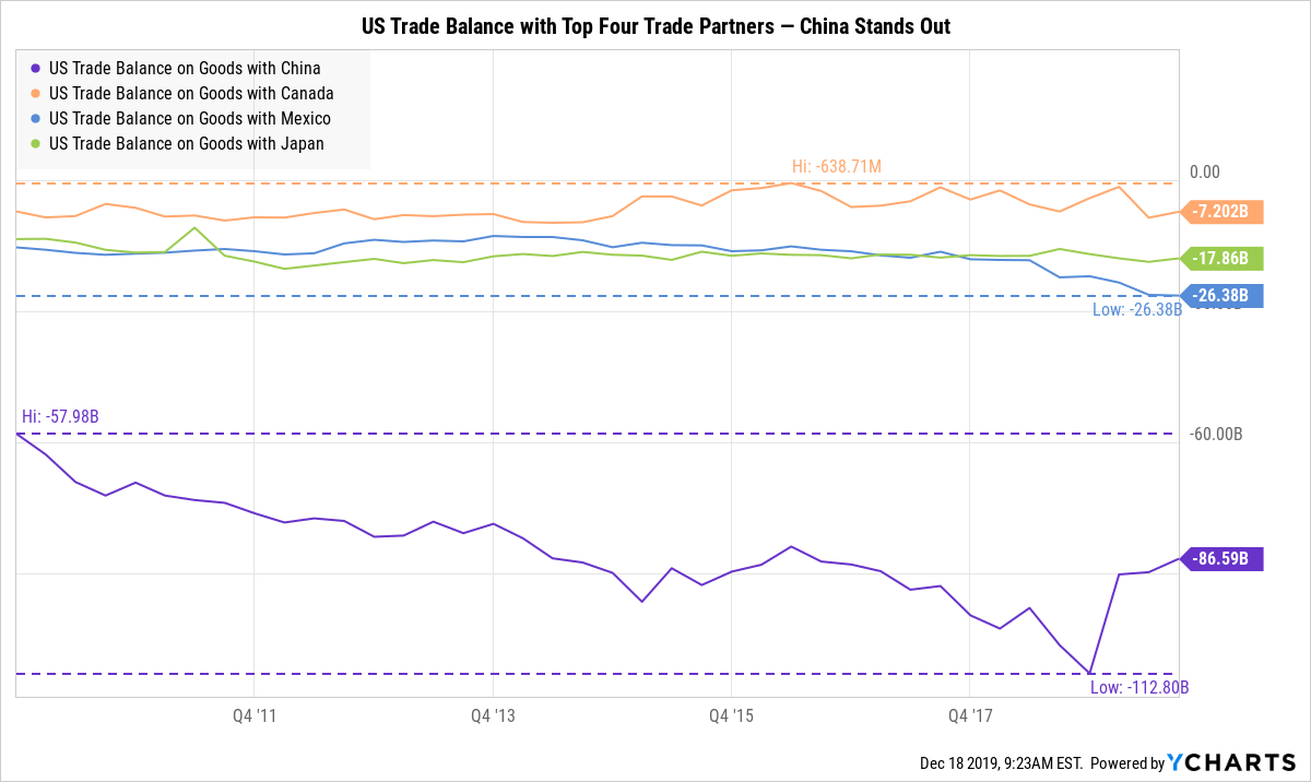
2. The US-China Trade Balance Versus Other Top Partners:
The United States’ top trade partners, in order, are: China, Canada, Mexico, and Japan. While trade deficits with the US’s second through fourth largest partners stayed largely unchanged throughout the decade, the US trade deficit with China was much more volatile. The US-China deficit consistently increased until Q4 2018 when it reversed its trend and decreased in each quarter of 2019 thus far. Despite the recent narrowing, the US trade deficit with China increased 49% over the last ten years.
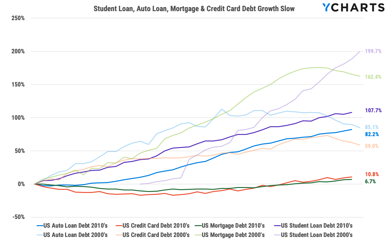
3. Student Loan, Auto Loan, Mortgage & Credit Card Debt Growth Slow:
Growing consumer debt, specifically from student loans, has been identified as a cause of concern for the US economy; however, growth in four categories of consumer debt slowed over the last decade. Student Loan Debt increased 199.7% from 2000-09, but only 107.7% from 2010-19. Mortgage Debt increased 162.4% from 2000-09, and only 6.7% from 2010-19 (this is most likely due to the housing crisis in the previous decade, but the slowed growth illustrates the consumers’ rising preference to rent, rather than buy houses). Auto Loan Debt increased 85.1% from 2000-09, and 82.2% from 2010-19. Credit Card Debt increased 59.0% from 2000-09, and just 10.8% from 2010-19.
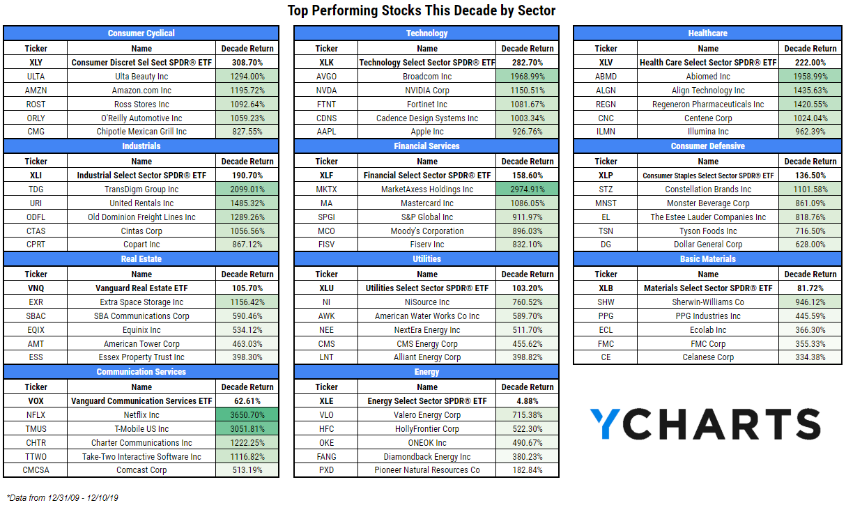
4. Top Performing Stocks This Decade by Sector:
The 2010’s were particularly kind to the Consumer Cyclical and Technology sectors, the only two of 11 to outperform the S&P 500’s total return of 248.2%. The best stock of the decade was Netflix (NFLX), up 3650.7% over just less than 10 years, with an annualized return of nearly 44%; even so, the stocks that make up the new Communication Services sector (mostly old Telecom and Tech stocks) returned only 62.6% on the decade in combination. Energy far underperformed all other sectors, posting only a 4.88% decade return, or 0.6% annualized.
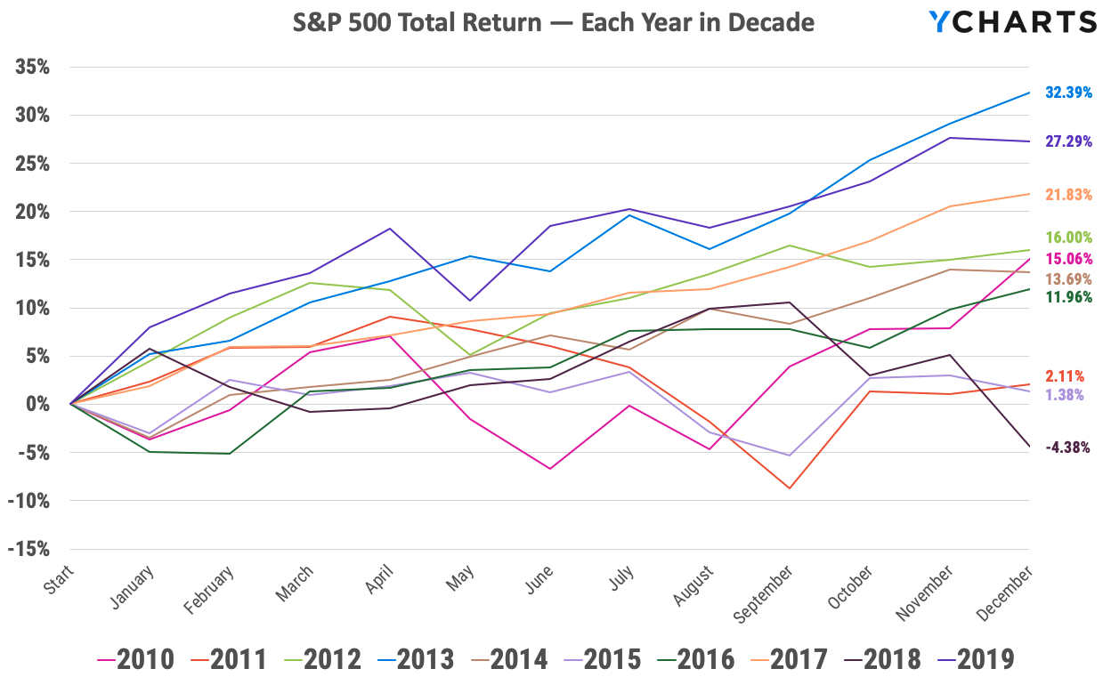
5. S&P 500 Total Return — Each Year in Decade:
This chart plots the S&P 500 Total Return for each year of the 2010’s. In those ten calendar years, the S&P 500 finished lower only one time, losing 4.4% in 2018. Three years had gains in excess of 20% (‘13, ‘17, ‘19); gains in seven years exceeded 10% annually (‘10, ‘12, ‘13, ‘14, ‘16, ‘17, ‘19); and in four years, the S&P went lower in January before going on to gain more than 10% in three of those years.
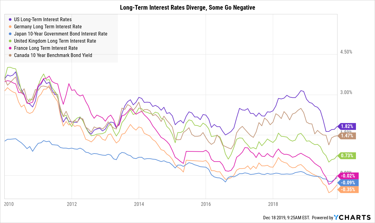
6. Long-Term Interest Rates Diverge, Some Go Negative:
Interest rates around the world were largely consistent to start the decade, when the US, Germany, UK, France, and Canada all offered long-term interest rates in the 3.1% to 3.6% range (Japan’s was at ~1.3%). Over the decade, several countries (Japan, France, Germany, etc.) moved to negative interest rate policies and the spread between different governments’ rates widened.
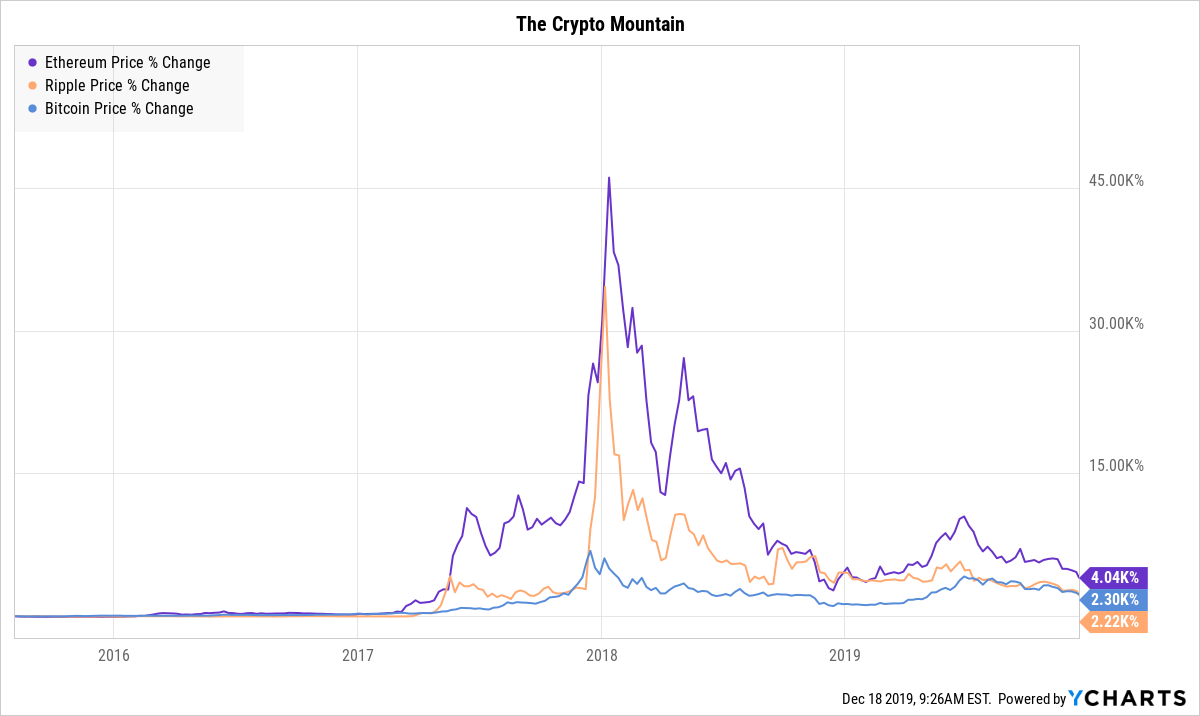
7. The Crypto Mountain:
Cryptocurrencies forever changed the regulatory landscape of financial markets when they forced us to ask, “is this a security?” Bitcoin, Ethereum, and Ripple, three of the largest cryptos out there, had their heyday in late 2017 and early 2018. While the chart shows a huge spike then fall from grace, Bitcoin is still up 2.5K% since mid-2015.
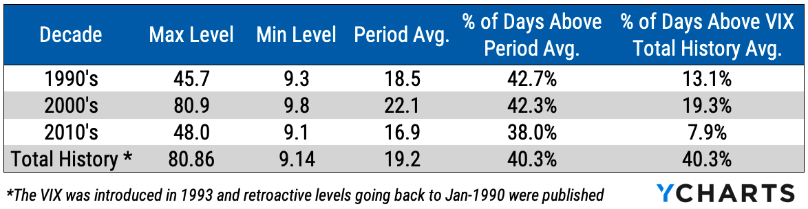
8. The Cboe Volatility Index Was Historically Low This Decade:
By volatility standards, the 2010’s were very calm. The Cboe Volatility Index (^VIX) hit its all-time low in this decade and only 7.9% of days in the 2010’s were above the historical average. The last few years of the decade have felt extremely volatile, potentially due to political narratives, but the data tells us that this decade was a calm one.
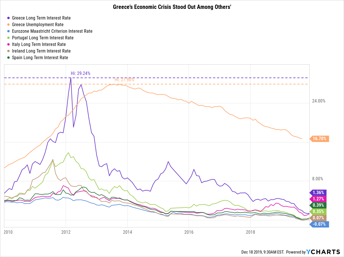
9. The Greek Economic Crisis:
A notable event in the early portion of this decade (think way back!) was the Greek economic crisis. In early 2012, the Greece Long Term Interest Rate (10 Year) reached a high of 29.24%. Meanwhile, the unemployment rate in Greece jumped to 27.90%. When compared to other Eurozone countries that faced similar economic troubles at that time, Greece was hit particularly hard.
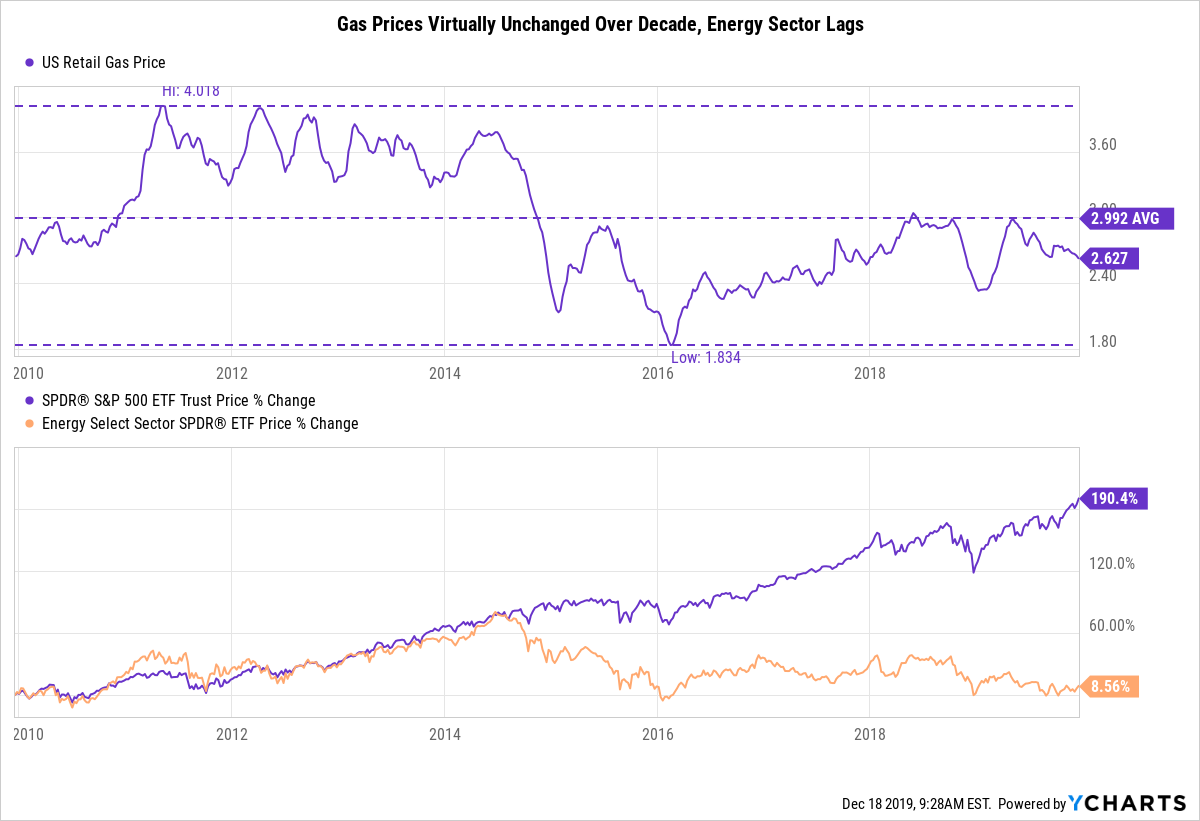
10. Gas Prices Were Virtually Unchanged and The Energy Sector Lagged:
While some people might say “everything went up this decade,” the exception to that rule would be the energy sector. US Retail Gas Prices per gallon ended the decade pretty much right where they started. While the SPDR S&P 500 ETF gained about 184.4% over the last decade, the energy sector was pretty much flat through the same time frame, up only 7.51% over ten years.
YCharts is an investment research platform that enables smarter investments and better client communications, and a multi-year Wealthmanagement.com Industry Awards finalist.


