
Coming from a background as a professional wrestler and designing the silliest of logos—even a logo for a wrestler named “Dashing Rock Ripper”—the financial advisor design spectrum can come across as limited. However, it doesn’t have to.
Just because your lingo consists of words that average people may struggle to understand (like “Roth IRAs,” “arbitrage” and “fiduciaries”), it doesn’t mean your design shouldn’t delight your target audience.
In 2021, there were approximately 14,800 RIAs employed in the United States. That number has been increasing every year. Now, there are currently over 203,791 financial advisors employed in the U.S. That’s a lot of advisors, which means that’s a lot of websites too.
You may ask, “But do I really need a website?” As of 2022, there are over 4.9 billion active internet users worldwide. That’s a lot of possible eyeballs. Given this figure, your website is crucial to the success of your business. Not having a website is like not being in the Yellow Pages in the 1980s or 1990s, and not having a well-designed website is sure to wash your website away in the sea of ones that are already out there. However, here is the double edge of that sword: A bad website can be just as bad for your business as having no website at all.
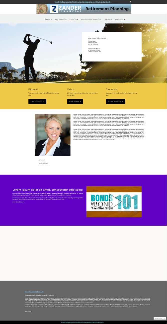
See this example of a subpar website:
I have had the pleasure of redesigning and building over a hundred financial advisor websites for more than 10 years. And while that may seem like a lot, it feels as if I’ve barely made a dent. When Lone Beacon started, we had a goal to be disruptors, and my focus was to bring cutting-edge design to the financial advisory industry.
While doing that, I’ve seen many websites riddled with design faux pas such as using cookie cutter drag-and-drop layouts. While these layouts are not 100% bad, 99% of the time they are. These websites are designed by someone with no knowledge of design, development, the time to dedicate to it, nor an understanding of how poor design can severely hurt sales and new-client conversions.
What ends up happening is they settle on a website with little to no balance. Their brand elements are not aligned, oftentimes the colors don’t work together, there is no messaging, images have poor resolution, and there are random areas of empty space (lots and lots of empty space). However, this is a preventable issue and does a lot of harm to your business. But many think a site like this is sufficient and settle for it.
It’s time for an update, don’t you think? So, let’s take a look at five must-have elements that are crucial to the success of your website as a financial advisor and how you can take your website from a lead capture zero to a lead capture hero!
We’ve Made Contact!
Lack of communication can lead to missed business opportunities.
We’ve all experienced this in our professional lives at some point. We’ve found a local business via a Google search or Instagram ad. We get to their website, and then we can’t find any contact information about that business. No address. No phone number. No nothing. What this immediately tells the viewer is that they cannot trust you or your business. Your lack of contact information immediately turns into a lack of transparency from the visitor’s perception. “Why would they not want me to be able to reach them?” the visitor starts to wonder.
A good website must reiterate contact information numerous times. Not only do you want to give the feeling that it’s easy to reach you and your firm, but, more importantly, you are encouraging the visitor to do so! For example, an easy way to do this is to incorporate a floating sticky contact bar so that no matter where on the site your visitor is, they are just one click away from reaching you. Utilizing this feature also provides the ability to offer numerous contact touchpoints whether by phone, Facebook or email. Remember, the more positive information the visitor can find about you online, the more they trust you.
At the very least, make sure that your contact information is always in your website’s header and footer.
The CTA Is Your Website’s Finish Line
A financial advisor website without a strong CTA is like fishing without bait. I’ve seen many websites’ CTAs buried in their site and appearing unappealing. It would just be a field for “First Name,” “Last Name,” “Email,” and “Submit.” Furthermore, those fields wouldn’t be aligned or balanced.
There are a few things wrong with this. The first is the CTA or lack thereof. “Submit” or “Click Here!” is not very attractive at all. Understand it’s 2022. My son was navigating my iPhone in his sleep by the time he was 3. We don’t need to label buttons as if they are some sort of new technology. The world knows what a button is and how to use it. Instead, dress it up. Let them know what the act of clicking there does. What’s in it for them?
It’s best practice to make your CTA attractive and aesthetically appealing to the eyes.
Ask yourself, which one of these are you more inclined to interact with?
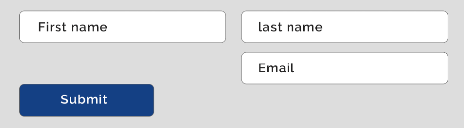
Old example

Our example
Interactive Elements
Just because all copy is inherently a paragraph doesn’t mean your content should be laid out on your website like a Word document. The internet is tricky; not only are we trying to impart knowledge to the visitor, but we are also trying to engage them and keep them engaged. Why not display your services or your process in a uniquely branded, interactive way?
A few examples of that would be using rollover elements, pop-up elements or animations. But remember, balance is key! And when it comes to interactive elements, less is more. Don’t overdo it! Or better yet, have design professionals, knowledgeable in the financial advisory space to do it! See examples of interactive elements we, at Lone Beacon, have built that drive major impact for financial advisory businesses.


The Personal Touch
Do you ever wonder why one of the most popular sections of a magazine or gossip website is the They Are Just Like Us section? We have this strange fascination with seeing celebrities do normal everyday things like taking out the garbage or cleaning up after their dog. We like to relate and think, “Ha! I do that too!” It makes the celebrity seem real and accessible and that a relationship is attainable. Well, the same can be said for personal touches added to your website. Small, easy elements can make huge differences. It sets your company apart from every other advisory. You and your competitors both offer financial services. Instead of concentrating on what you can do, show them who you are. Set yourself apart. It’s also worth noting that in your efforts to showcase who your company is, spending the extra time and money on professional headshots pays off in spades.
Community
When I talk about this with clients, they immediately think of social media. But community is much more than that. I like to think of this element as the super child of “The Personal Touch” element and your “Social Media Brand.” It’s important that people know you and know that you give back. People love to see that you enjoy enriching your neighborhood, communities and family. A couple of ways we accomplish this is by creating a Charities page that highlights all the charitable actions you and your firm take.
You can also consider launching a referral program that allows your best assets, your clients, to share you with loved ones. You can also utilize client testimonials. No one is a better salesperson than your best clients. People love to be involved in a community with like-minded individuals and interests. That’s why we see marketing success when companies find ways to not only show people who they are, but what they do, what they support, and the positive impact they are making on the world around them.
These are five simple yet effective elements that you, as a financial advisor, can concentrate on when developing your website. And these elements will have a profound impact on your brand when it comes to setting you apart from your competitor.
Kirby Mack is vice president of digital media at Lone Beacon, a full-service marketing company dedicated to serving the financial industry.


