
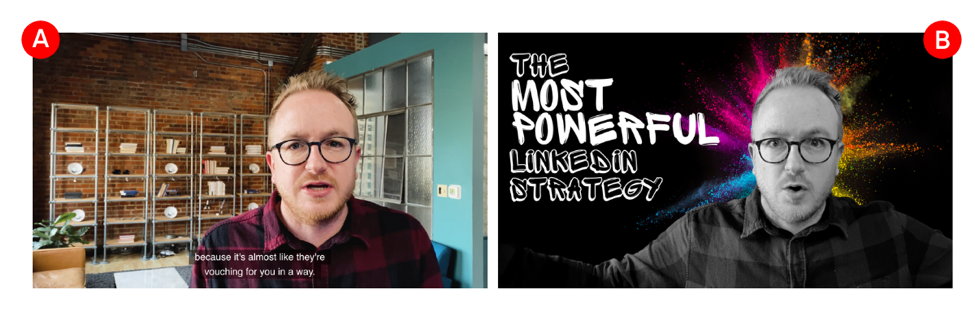
Envision two videos side by side.
The first video (video A) uses a screenshot selected at random, which is the default for most social networks and video hosts. The second (video B) includes a posed photograph of the subject conveying emotion, bold text, compelling graphics and a vibrant color combination. Which video do you click on first?
Video thumbnails are important. As someone scrolls through their social feeds or looks through a list of YouTube videos, the thumbnails often dictate whether or not they click. Thumbnails offer a sneak peak of what’s to come, hinting at the quality or lack thereof. Similar to a book cover or email subject line, a good thumbnail will entice your viewers to take the next step.
Here are a few tips to make them irresistibly clickable:
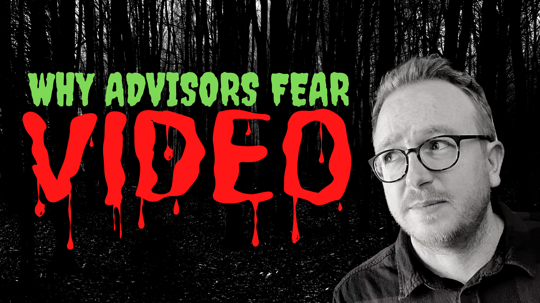
1. Feature Your Face. Ideally, your thumbnail includes the face of your subject, even if you’re ugly like me. Why? Humans are naturally drawn to people’s faces. We’re visual creatures wired to read complex emotions. For us, thumbnails that make eye contact (look at the lens) and convey strong emotion almost always generate more plays.
If using your subject’s face isn’t an option—that’s OK. Find a royalty-free photo from a website like Unsplash.com or Pexels.com. If you’re unable to find a free version that suits your goals, try Shutterstock.com. Your goal is to find a graphic that conveys the emotion you want to convey with your video.
Here's an example with my mug and an attempt at looking afraid.
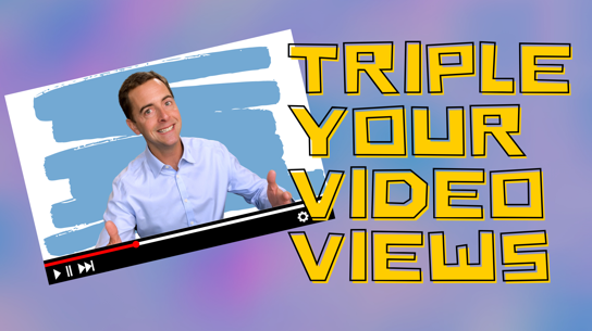
2. Include Large Dynamic Text. If you’re required to adhere to strict brand standards, this can only go so far. However, if you have flexibility, have fun with your fonts! Websites like DaFont.com and FontSquirrel.com have thousands of free options.
Also, don’t make the mistake of putting too much text on your thumbnails. There is a tendency to assume your thumbnail needs to be the full title of your video—that’s not the case. Your goal is to convey the value of watching in six words or less and make the text fairly large. Remember, most of these thumbnails are going to be relatively small on your audience’s mobile device—so think big.
Here’s an example of a fun font directly conveying the value in only four words.
3. Don’t Forget Your Background. Adding a background pattern, gradient or texture gives your thumbnail more depth and avoids the video looking too bland.
In the example below, notice the subtle “networking” pattern in the background.

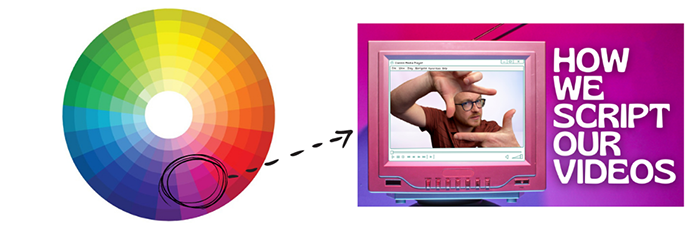
4. Color Selection is Crucial. When selecting a color pallete, try and use complementary colors. What does that mean? That means that you’re using colors on the opposite sides of a color wheel.
Sometimes we’ll use analogous colors as well. These are colors that are next to or fairly close to each other on a color wheel. These tend to be more pleasing to the eye. Here’s an example using analogous colors pulling from the bottom right of the color wheel above.
Lastly, whenever in doubt, try and use brighter colors to make your video pop in a sea of other videos competing for attention.
5. Use the Right Dimensions and Resolution. This seems obvious, but designing a thumbnail in the wrong dimensions can severely hurt the quality. In general, you’re almost always going to use a 16 x 9 aspect ratio. According to YouTube, your thumbnails should have a resolution of 1280 x 720 (with minimum width of 640 pixels). Here’s a quick YouTube guide we created.
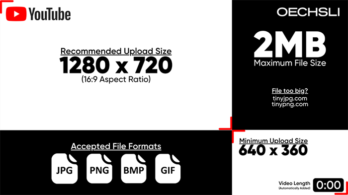
For other video hosts, run a quick search to find out their desired dimensions and resolutions before designing.
When you put a lot of energy into recording and editing your videos, it’s important to not ignore your thumbnail. It’s arguably the most important component to get people to click the play button.
Kevin Nichols is a partner with The Oechsli Institute, a firm that specializes in research and training for the financial services industry. @KevinANichols www.oechsli.com


