
Before I go into my more macro thinking, I’ll start with a simple 10-year U.S. Treasury yield bar chart with — highlighted in rose — a very defined sideways channel whose broad parameters are 2.31 plus to 2.63+ percent. Having been bullishly biased, the near-term charts look a bit more bearish with momentum shifting to higher yields. I’m not that bearish, but it’s a range and we got near the upper reaches.
It surely is noteworthy that with the close in the week just passed around 2.41+ percent, said yields are lower than they were at the close on the day of the last two Fed hikes. Interesting, no? Clearly there’s some divergence between Fedspeak, targets and the market. It’s not the only divergence out there; below I elaborate about sentiment measures being harder economic data.
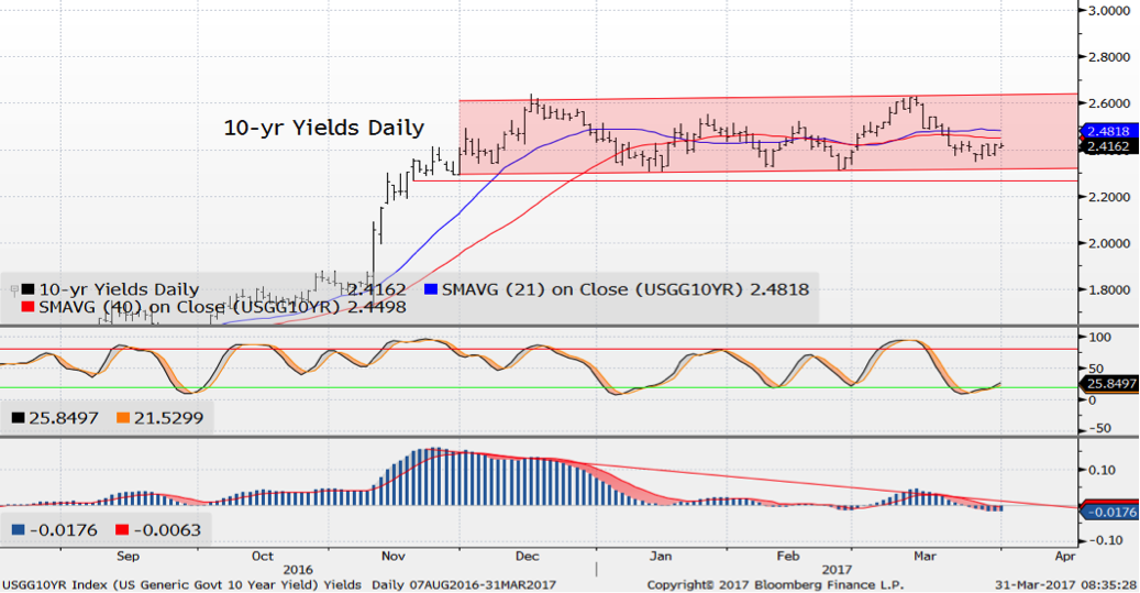
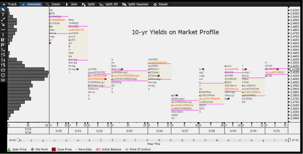
For now, I think the 10-year Treasuries will err towards the 21-day moving average at 2.48 percent and then 2.54 percent (highs reached after the last hike). Note that one thing helping such a goal is the behavior of 10-year Treasuries on Market Profile, a histogram of yields versus volumes. What you’ll see on that chart is a series of gently rising volume "bulges," meaning simply we’re trading more at marginally higher yields. Move over 2.44 percent, the top of the very recent activity, and that 2.48 percent comes into play.
I had the opportunity recently to conduct (is that how you phrase it, “conduct”?) a webinar entitled “Demographics and Long-Term U.S. Growth Impact.” That was the working title. The practical title should have been something along the lines of “Trump promises to make America great again, but he can’t make us young again.” The upshot of the presentation was that our demographics pose a long-term restraint on economic growth, and by long-term I mean for a generation to come.
There are many issues at hand, the essence of which is that the older population cohorts are becoming an increasing proportion of the U.S. population, a move which will continue apace for, oh, about a half century more. This translates to a slow rate of household formation and labor force growth for starters. You need both, along with productivity gains, to boost GDP.
There is a more immediate set of problems for the aging population. One is that they are, as a group, ill-prepared for retirement when measured by savings in retirement accounts. Anecdotally, the aging boomers are staying in the workplace longer, which is a good thing in terms of sustaining the labor force. However, to some extent it is also a forced situation as they simply need to work. A difference between this older workforce and the population as a whole is that older workers tend to seek flexibility in terms of schedules, vacation time and simply, need medical coverage. A recent Fed study showed they tend to earn less than they once did and certainly income gains slow dramatically for people in their 50s and beyond.
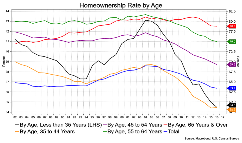
In the course of the presentation I touched on household formation, how slow its been and a general decline in the rate home ownership. That decline should raise concerns when baby boomers start selling their homes since they are by far the group that owns homes. Further, the implication is that there will be arising inventory of homes, specifically older and aging homes, for years to come.
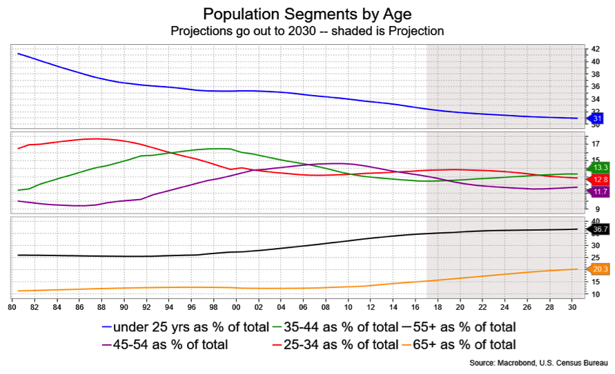
That the U.S. population is aging is an established fact. The median age today is 37.8 years. In 2000, it was 35.4 years and in 2026 it will be 39.3 years. As a percentage of the total population the 55+ fogeys make 34.7 percent. That was just 27.4 percent in 2000 and grows to 36.4 percent in 2016; by 2026, it will rise to 38.9 percent.
Here’s the thing: the homeownership rate has been declining quite sharply. That rate stands at 63.4 percent for the overall population against a peak of 69 percent in 2004. However, the rate for the older cohorts has been relatively steady and rather higher than for the younger cohorts. Homeownership for the 65+ set is the highest for the population at a whopping 78.8 percent against it’s peak of 81.1 percent in 2012. Contrast that with the 35-and-under set.
So with the 55+ folks having the highest rate of homeownership, and their ranks having grown (and continuing to grow) relative to the population, who is going to be upsizing when retirees are downsizing? The answer would seem to be far fewer than we’d like.
Equity in a home remains the most important asset for U.S. households and, traditionally, has been a reliable investment to help supplement a comfortable retirement. The broader demographic shifts which I’ve discussed would argue that one’s home no longer fits the bill. At the least, it’s role is at risk of being severely diminished.
A recent Fed study (Liberty Street Economics, A Close Look at the Decline of Homeowership) made note of the data presented in these charts. The conclusion contained this line: “Why this secular decline is occurring is unknown.”
They suggested declining real income for some households and give a nod to "urbanization." Both make sense. To those I’ll add in no special order, 1) debt-laden college graduates who will remain renting longer, 2) smaller U.S. family size, 3) preference by well-to-do youth to stay urban, 4) crappy homes and McMansions built in the last 25 plus years that don’t hold their value, 5) millennials "postponing" traditional household formation or finding alternatives (don’t ask). I’m sure there are other factors and I’d love to hear your thoughts on the matter.
In any event, the point, if I haven’t made it already, is that the older cohorts probably have less "value" in their most important asset than they think, or certainly a more tedious time when trying to sell it when sunnier climes beckon.
Earlier in March, I made note of the divergence between the confidence measures exhibited by everything from various ISMs and regional Fed reports to University of Michigan and the Conference Board. (As an aside, one confidence measure stands out in its weakness, which is that of presidential approval. Trump’s approval rating is down 35 percent according to Gallup, 37 percent out of Quinnipiac and a lofty 40 percent according to CBS. According to Business Insider, “It took Trump just 69 days to accomplish something that the country's most unpopular presidents took years to achieve.”)
Anyhow, we offer kudos to Bloomberg Intelligence economist Michael McDonough (whose approval rating by me is especially high) for casting light on that divergence between confidence and other economic measures. In short, the charts below were lifted from him.
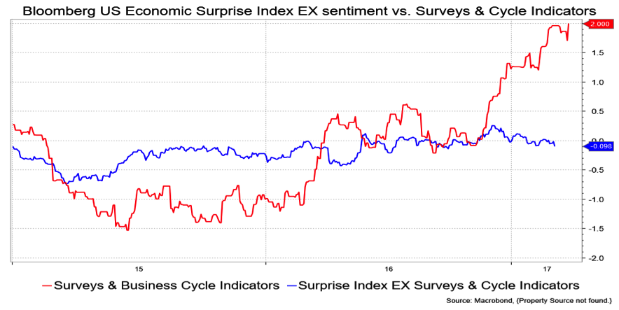
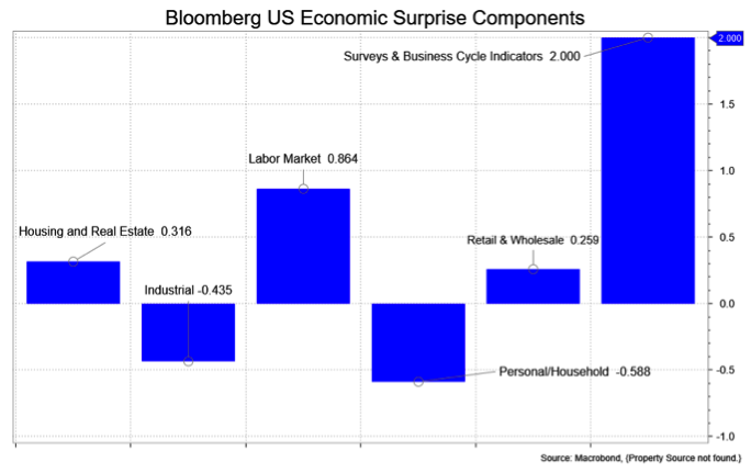
McDonough looked at the components to Bloomberg’s Economic Surprise Index, a composite measure that looks at how much prognostication experts i.e., economists, under- or over-forecasted a given economic release. What he did was break down the Surprise Index into its components to show that the gain was largely about sentiment, surveys and the like. In contrast the combination of other measures (adding them up and taking average) that look to the "real" economic data were underperforming and in most cases quite sharply.
I remind you all that sentiment doesn’t contribute to GDP.
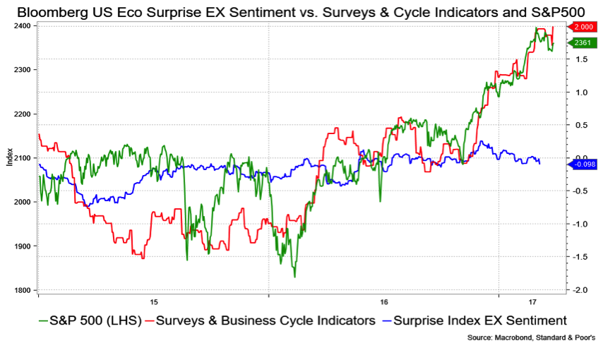
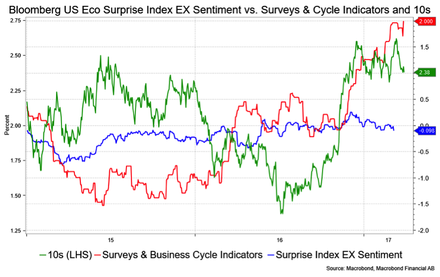
I could have left things at that, but being the jealous sort took things one step further to try and gauge what the markets are responding to. I think the charts make this pretty clear. The visual correlation with sentiment and the S&P500 is strong. Although I probably did this wrong, it appears to be better than a 90 percent correlation since the election and sentiment leads. The correlation is there with 10s as well, but more like 65 percent.
So, there it would appear that the sentiment measures have indeed been driving price action in both stocks and bonds and sentiment can be a fickle thing. I offer that up as a warning that either the data catches up or the markets are mispriced. The price action post the non-vote on the Affordable Care Act underscore this to a degree.
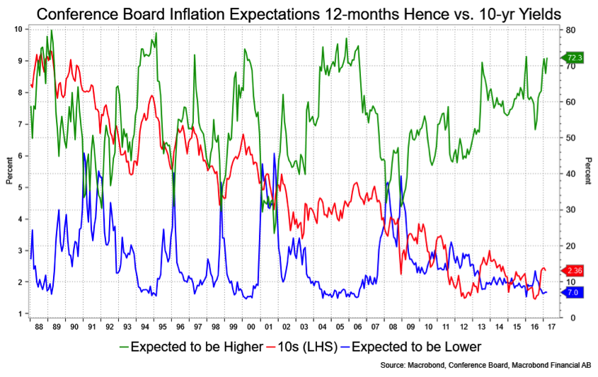
Speaking of sentiment, we just got to see the Consumer Confidence report for March which was huge. A component to that, which I have not traditionally followed (I prefer U Michigan), is the "inflation outlook 12-months hence." Well, the expect higher inflation element soared to 72.3, just about tagging the highs of this cycle while the expect lower inflation camp drops to 7 percent, which is right on top of the lows of this cycle.
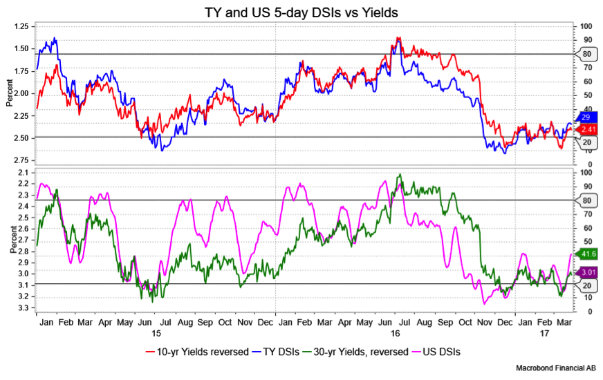
As you perhaps suspect already given my bias, these have proven to be remarkably good contrarian signals over time. They are NOT good short-term signals, however. For that, I reference back to the Daily Sentiment Index, pictured below, which is in bull mode.
David Ader is Chief Macro Strategist for Informa Financial Intelligence. For further information, please see: https://financialintelligence.informa.com/