
The answer to the question posed in the title is harder to nail down than it at first seems.
Here are some ideas, expressed through my favorite medium—charts, which have cropped up to explain recent behavior in 10-year yields ("10s") and try to predict what comes next.
The first chart here is of a not-so-widely watched measure (at least among rates strategists)—the Dow Jones Transport/Utilities ratio, which I’ve overlaid with 10s. The idea is that transports are cyclically growth-oriented and utilities-defensive. As the ratio drops, utilities outperform, and vice versa. The correlation has been very strong, with an 83 percent R-squared over the last year, though that drops sharply when you extend the timeframe. The recent steep drop in the ratio suggests that 10s should be at lower yields.
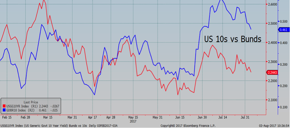
Then we get to U.S. versus Bunds, which is a much clearer example of simple yield movements in major interest rate markets. The interesting thing here would be if and when there’s divergence, which is good for a trade but not a long-term strategy—at least not yet. Still, it does beg the question of which is driving which, so for a given day when, say, the European Central Bank hints at ending quantitative easing, Bunds lead, which creates a buying opportunity for U.S. 10s. Still, it’s the correlation here that’s seems to be the news in and of itself and convenient for the intraday punditry—“US 10s are under pressure this morning because Bunds sold off.” Not very satisfying, is it?
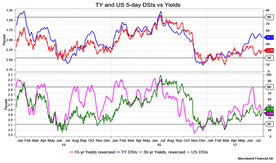
Finally, there’s my trusty Daily Sentiment Index, which, like the charts above, shows a brisk visual correlation (though an inverse one) between yields and sentiment. Do note that with these DSIs (near 50 for TY and 41.6 for U.S.), we’re really in neutral territory, neither overbought nor oversold.
As you might imagine, 10s do tend to track well with inflation figures. For instance, year over year, personal consumption expenditure has had a 75 percent correlation with yields over the last 18 months, which is saying something (70 percent R-squared). While I am compelled to look at all of the above and then some, I can’t honestly say that I, or you, should rely on one vastly more than another; at a given moment, you can data-mine the heck out of things and say “Eureka!” This is it. But then you’ll need to figure out which comes first, the chicken or the egg.
David Ader is chief macro strategist for Informa Financial Intelligence.