

If you subscribe to common wisdom, the late-summer market selloff must have you thinking about the potential for a true recessionary slide. After all, the stock market looked like it had topped out after a stunning six-year run. Many investors and pundits subscribe to the notion that the stock market is a leading indicator of the economy’s direction.
True believers assume that certain market sectors will price in improvements some six to nine months before their fundamentals actually perk up. They use these signals to overweight favored industries while paring exposure to those segments most likely to falter.
The trick to this rotation business is, of course, correctly identifying the market’s current state. How do you, after all, spot ascendant sectors? And which ones fare best—or worst—at different points in the economic cycle?
The second question’s pretty easy to answer. The first not so much, but we’ll get to that in a minute.
Research has shown pretty strong correlations between sector performance and economic phases. Sam Stovall, chief equity strategist at S&P Capital IQ Equity Research, famously mapped the relationship when he authored “The S&P Guide to Sector Investing” in 1995 (see chart).
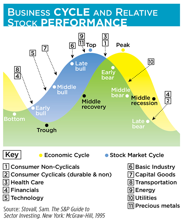
If Stovall et al are to be believed, we could confirm a market top if we found bullish signals in the sectors that outperform during contractions, i.e., consumer staples (non-cyclicals), health care, utilities, financials and consumer discretionary (cyclicals).
So let’s get back to that first question. Just how do we spot sectors poised for liftoff? Fundamental analysis won’t avail us for a timing decision like this. Here, technical indicators and trend analysis work better. But what indicator? And what trend?
Sector Performance is Time-Dependent
It’s best to look at a mix of near-term and longer-term signals rather than relying upon a single marker. After all, sector performance is time-dependent: some industries will do better in the early phase of a recession, others in the midphase. You can then weight each indicator according to your confidence in its predictive power. There’s a wide range of indicators you can employ, but a half dozen or so seems ideal and nondilutive. Try these as examples:
• Point & Figure Price Objective: A point and figure chart, by its nature, filters out a lot of market noise, making longer-term price objectives easier to see. On the basis of its predictive strength, we’ll assign it a 25 percent weight.
• Seasonality: Sector performance does, to a certain extent, depend on the calendar. Looking back over the past five years, we can rank final-quarter performance for each sector and ascribe a 20 percent weight.
• Relative Performance: Plotting each sector’s 200-day performance against the broad market, represented by the SPDR S&P 500 ETF (NYSE Arca: SPY), measures changes in the degree of investor interest. Let’s make this a 15-percent factor.
• 20-Day Volatility: Here, we’re rating low volatility more favorably because gains are more likely to be retained in a stable price trajectory. We gauge changes in 20-day volatility over a 12 month period. This, like all the subsequent metrics, earns a 10 percent weight.
• Relative Strength: Each sector ETF’s price strength is measured against the entire universe of ETFs over the past 12 months.
• Momentum: This indicator measures each sector ETF’s 6-month price trend versus its 12-month trend. A higher rank is assigned when the longer-term trend exceeds the shorter-term.
• Percentage Price Oscillator: Another momentum indicator, PPO often signals trend changes before price tops and bottoms are formed.
To create a model sector array, we can employ the wildly popular universe of State Street SPDR Select Sector ETFs as proxies. We’ll weight the ETFs’ indicators, ranking each ‘1’ through ‘9,’ with ‘1’ representing the highest rank and ‘9’ the lowest.

Four Sectors Likely to Outperform the Market
Putting the indicators together, the four sectors now likely to outperform the overall market are consumer staples, financials, consumer discretionary, and utilities—all signposts on the recessionary trail.
With a case made for recession, we have to wonder if the SPDR Select Sector products are the best vehicles to use in a portfolio overweight. Maybe they are, but it’s worth looking around to see if there are better alternatives.
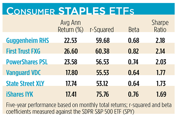
There are a half-dozen ETFs focused on the large-cap consumer staples sector, including the Consumer Staples Select Sector ETF (NYSE Arca: XLP). From a reward-to-risk standpoint (i.e., the Sharpe ratio), the category leader is the Guggenheim Equal Weight Consumer Staples ETF (NYSE Arca: RHS). RHS holds the same number of consumer staples stocks as the S&P 500 but, by equally weighting them, gives more heft to the smaller issues. That tilt’s given RHS a performance edge over the rest of the field while keeping a lid on volatility. The iShares Dow Jones U.S. Consumer Goods ETF (NYSE Arca: IYK), sporting the category’s highest beta coefficient, lags the other five funds.
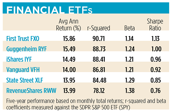
There’s less dispersion in the returns of financial sector ETFs, but a clear standout is the First Trust Financials AlphaDEX ETF (NYSE Arca: FXO). FXO is the only product that earned a better-than-breakeven Sharpe ratio over the past five years. It’s also the ETF most highly correlated with the S&P 500 proxy portfolio. Among volatile financial ETFs, high correlation is a good thing, a fact confirmed by the low r-squared coefficient and high beta of the bottom-scraping RevenueShares Financials Sector ETF (NYSE Arca: RWW). RWW earns the distinction because its portfolio is revenue-weighted, tilting it toward larger-cap financial institutions.
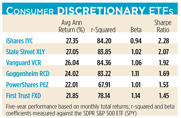
The iShares Dow Jones U.S. Consumer Services ETF (NYSE Arca: IYC) earned the best risk-adjusted return in its category, owing largely to its low beta. The high-beta product, the First Trust Consumer Discretionary AlphaDEX ETF (NYSE Arca: FXD), is the worst performer. FXD’s multifactor index methodology and tiered equal-weighting scheme yield a risky tilt to the portfolio which hasn’t paid off in outsized gains.
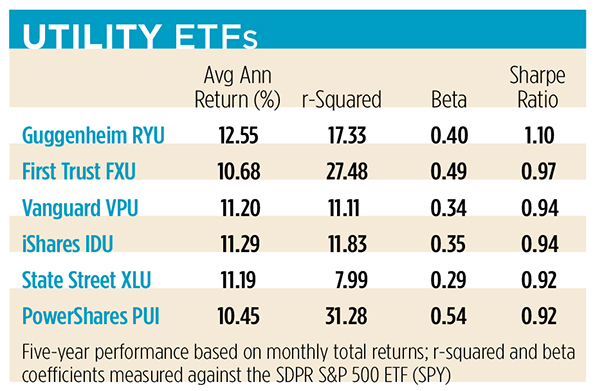
Among utility sector ETFs, the Guggenheim S&P Equal Weight Utilities ETF (NYSE Arca: RYU) earns the only 1+ Sharpe ratio. RYU owes its high return-to-risk tilt to its telecom allocation, which also accounts for the fund’s exceptionally high dividend yield. In the cellar is the PowerShares DWA Utilities Momentum ETF (NYSE Arca: PUI), a fund that weights its portfolio on the basis of its components’ price momentum. Over the past five years, momentum added volatility without a commensurate enhancement to returns.
If you’re going to gird your portfolio for a recessionary turn using sector rotation, it’ll pay for you to consider lower-beta ETFs. State Street’s ETFs may be category-killers in terms of size, but they’re a fairly volatile lot. As a class, better risk-adjusted returns are earned by the Guggenheim set of equal-weighted portfolios.
No one’s obliged to use a single purveyor, of course, but commission-free ETF trading offered by some brokerages acts as a sort of loyalty program. Staying loyal to portfolio performance may require some careful picking and choosing.